App Icon Design Trends (2025): AI, 3D, Gradients, Accessibility
As we move through 2025, app icon design is evolving with advances in AI, growing expectations for personalization, and mature design systems. This guide explores ten notable directions shaping app icon work this year.
Related: A/B Testing Icons, Color Psychology, Icon Formats & Performance
Key Takeaways
- Trends are inputs, not rules—test fit with your audience
- Balance novelty with recognition and accessibility
- Design for both light and dark contexts from the start
- Use micro-animations sparingly; prioritize clarity
- Build a style system that can evolve over time
1. AI-Generated Aesthetics
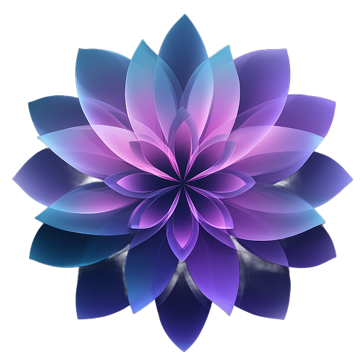
The rise of AI-powered design tools has introduced a new aesthetic category that blends photorealistic elements with abstract concepts in ways human designers rarely conceived. Icons now feature impossible geometries, surreal color combinations, and hybrid styles that capture attention in crowded app stores.
Key characteristics:
- Dreamlike quality with unexpected element combinations
- Perfect imperfections that feel both digital and organic
- Color palettes that push beyond traditional harmony rules
- Textures that exist only in the digital realm
Tools like Icon Maker Studio are pioneering this trend with AI models specifically trained for icon generation, allowing designers to explore concepts that would take hours to create manually.
2. Neo-Brutalism
Breaking away from the polished, perfect aesthetic that dominated the 2020s, neo-brutalist icons embrace raw, bold, and intentionally unrefined designs. This trend speaks to users tired of overly sanitized interfaces and craving authenticity.
Design elements include:
- Thick black borders and harsh shadows
- Clashing colors that demand attention
- Asymmetrical layouts and unconventional typography
- Raw, unprocessed textures and materials
This trend works particularly well for apps targeting Gen Z audiences or brands wanting to stand out in conservative categories.
3. 3D Clay & Soft Renders
The 3D clay aesthetic has evolved from a niche style to mainstream adoption, with major apps updating their icons to feature soft, touchable surfaces that invite interaction. These icons create depth without overwhelming the small canvas of an app icon.
Why it works:
- Creates visual hierarchy through depth rather than color
- Feels approachable and friendly
- Scales beautifully across all icon sizes
- Distinctive enough to stand out while remaining professional
4. Glassmorphism Evolution
While glassmorphism isn't new, 2025 sees its evolution into more sophisticated applications. Modern glassmorphic icons layer multiple translucent surfaces with subtle refractions and chromatic aberrations that create depth and luxury.
The key to successful glassmorphism in 2025 is restraint—using the effect as an accent rather than the entire design foundation.
5. Gradient Renaissance
Gradients are back with a vengeance, but they're more sophisticated than ever. We're seeing complex multi-color gradients, mesh gradients, and animated gradients that shift based on device context or time of day.
Popular gradient styles:
- Aurora-inspired color flows
- Holographic and iridescent effects
- Noise-textured gradients for organic feel
- Contextual gradients that adapt to wallpapers
6. Micro-Animations
Static icons are becoming a thing of the past. Subtle animations on hover, tap, or based on app state provide feedback and delight users. These micro-interactions make apps feel more alive and responsive.
7. Dark Mode First
With dark mode widely adopted across devices, icons designed primarily for dark backgrounds are becoming common. This means reconsidering contrast ratios, color choices, and border treatments.
8. Accessibility Icons
Inclusive design is no longer optional. Icons that work for users with color blindness, low vision, or cognitive differences are essential. This trend emphasizes clear shapes, high contrast, and symbolic clarity over artistic expression.
9. Retro Pixel Art
Nostalgia continues to influence design, with pixel art making a surprising comeback in app icons. Modern pixel art icons blend retro aesthetics with contemporary color palettes and animation techniques.
10. Minimalist Line Art
At the opposite end of the spectrum, ultra-minimalist icons using single-weight lines are gaining traction, especially in productivity and utility apps. These icons prioritize instant recognition and timeless design over trendy aesthetics.
How to Implement These Trends
Successfully implementing these trends requires understanding your audience and brand identity. Here's how to approach it:
- Audit your current icon: Understand what works and what doesn't
- Research your competition: Identify opportunities to differentiate
- Test with your audience: Use A/B testing to validate design decisions
- Consider technical constraints: Ensure your icon works at all required sizes
- Plan for evolution: Design systems that can adapt to future trends
Conclusion
The app icon trends of 2025 reflect a design ecosystem that's more diverse, inclusive, and experimental than ever before. Whether you embrace AI-generated aesthetics, neo-brutalism, or minimalist approaches, the key is authenticity and connection with your users.
As these trends continue to evolve, tools like Icon Maker Studio are making it easier for developers and designers to experiment with different styles quickly and affordably. The democratization of design through AI means that great icons are no longer the exclusive domain of large companies with big design budgets.
Try Icon Maker Studio's AI-powered generator with all these trending styles built-in. Create professional app icons in seconds.
FAQ
Sources
Stay in the loop
Get icon design tips, AI updates, and tutorials in your inbox.
